List of R Commands from each lab

Lab 2
To tabulate variable contents or calculate summary statistics, we use two functions:
summary( ) # lists min, max, median, mean, 25 and 75th %
Example:
> summary(poll$cheneyft)
Min. 1st Qu. Median Mean 3rd Qu. Max. NA's
0.00 30.00 50.00 49.51 70.00 100.00 72.00
In the example, `NA’s’ refer to missing observations. (In this poll, some people skipped the question.)
We can inspect variable contents across groups of a second, factor variable. We use the function
tapply(VARIABLE NAME, GROUPING VARIABLE, FUNCTION NAME, na.rm=TRUE)
The function name can be any command such as mean, min, max, sd, var, or quantile. For example, to calculate means on the feminist feeling thermometer score, by broad party identification groups, we use:
tapply(poll$feministsft, poll$party, mean, na.rm=TRUE)
Republican Democrat Independent
48.96497 64.78370 55.59221
The above output shows the means for feeling toward feminists given party groups.
For quantiles:
> tapply(poll$feministsft, poll$party, quantile, na.rm=TRUE)
$Republican
0% 25% 50% 75% 100%
0 40 50 60 100
$Democrat
0% 25% 50% 75% 100%
0 50 60 85 100
$Independent
0% 25% 50% 75% 100%
0 50 50 70 100
The other portion of the lab consists of graphical displays of data. I demonstrate those command here:
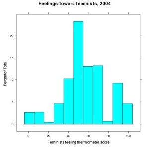
histogram(~ feministsft, data=poll, main="Feelings toward feminists, 2004", xlab="Feminists feeling thermometer score")
The basic structure of the command is histogram(~ VARIABLE NAME, data=DATA SOURCE)
Density plots can be thought of as smoothed versions of histograms. (We’ll consider the technical details at the end of the course. For now, when plotting these figures, focus your attention on the visual distribution of each variable. )
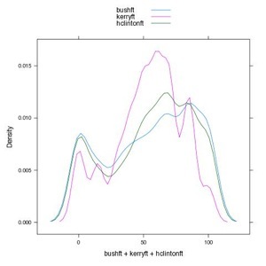
To plot two feeling thermometers together, each variable name is separated by a + sign. You can plot as many as you like. Here’s a density plot comparing Bush, Kerry, and Hillary Clinton
densityplot(~ bushft + kerryft + hclintonft, data = poll, plot.points=FALSE, auto.key=TRUE)
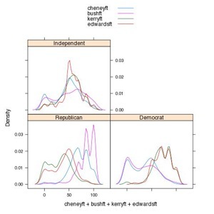
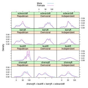
Here are a couple more examples of density plots with paneling.
densityplot(~ cheneyft + bushft + kerryft + edwardsft | party, data = poll, plot.points = FALSE, auto.key=TRUE)
densityplot(~ cheneyft + bushft + kerryft + edwardsft | party, data = poll, groups = gender, plot.points = FALSE, auto.key=TRUE)
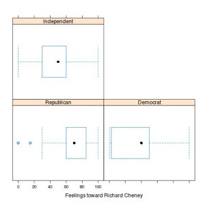
A Box-Whiskers plot. The | symbol is used to panel different comparisons of feeling thermometers. The | symbol appears after the main variable intended to be displayed as a boxplot.
> bwplot(~ cheneyft | factor(party), data=poll, xlab="Feelings toward Richard Cheney" )
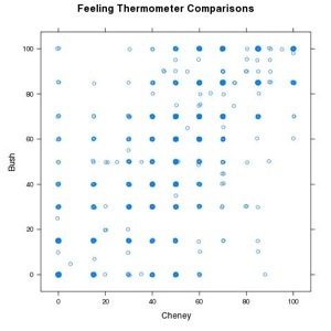
Two Scatterplots, one with and without jittering:
First we plot two feeling thermometers:
xyplot(bushft ~ cheneyft, data=poll, ylab="Bush", xlab="Cheney", main="Feeling Thermometer Comparisons")
The plot obscures a lot of covariation, due to overplotting. For example, all the people who gave Bush and Cheney 100s (or nearly so) in their evaluations have their points plotted on top of one another.
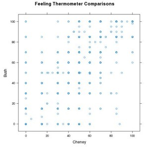
Next, we add “jitteryness” to the plot --- a tiny random score is added or subtracted to each variable (such as plus or minus .01), so that in the plot the scores appear plotted next to one another instead of directly on top.
xyplot(jitter(bushft) ~ jitter(cheneyft), data=poll, ylab="Bush", xlab="Cheney", main="Feeling Thermometer Comparisons")
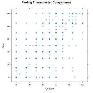
While better, the overplotting is still apparent. You can add stronger jittering with the factor= argument. (Factor can vary from 1 to 3 without too much distortion; but try larger numbers such as 5 and you will see what results.)
xyplot(jitter(bushft, factor=2) ~ jitter(cheneyft, factor=2), data=poll, ylab="Bush", xlab="Cheney", main="Feeling Thermometer Comparisons")
Lab 1
getwd() # getwd() lists current working directory
dir() # lists all of the contents of your working directory
ls() # lists the objects, including data, or anything else created
# At the beginning of every lab, you will need to load the required packages
# create an object that contains lattice
lab1.packages <- c('lattice')
# installs the packages assigned "gets <-"
install.packages(pkgs=lab1.packages)
# Calls the lattice package into R
library(lattice)
# Turns off color on lattice graphics
trellis.device(color=FALSE)
# used to read in a CSV dataset
read.csv("CSV DATASET NAME HERE", header=TRUE)
# For example:
# stores crime.txt as a dataframe (a dataset) called crime
crime<-read.csv("crime.txt", header=TRUE)
names(DATA) # lists variables in dataset, such as names(crime)
plot(DATA) # Produces a scatterplot matrix for all variables in data
DOTPLOTs and xyplots, re-order function.